

Currently Empty: $0

Today data has become an important asset for business decisions. Data can contain an enormous amount of potential value, but it may not create value unless insights are uncovered and translated into action or business outcomes. There are many kinds of data visualizations and each has a different purpose. For example, time series data can be best represented with a line chart. Some of the most popular techniques for conveying information are histograms, line and column charts, scatter plots, maps, pie charts, heat maps etc.
Presenting charts and graphs as separate pieces of information is no longer the best way to reach your audience. The new trend is turning data into a story, bringing with it a whole new set of opportunities and challenges to be discussed when considering the art of storytelling. In this data-driven world, data storytelling is a vital enabler that will help organizations succeed. Data can be complex to process and cumbersome to share. Visual representation of data in the form of charts and graphs can be used to convey information more effectively.
What is data storytelling and why it is important?
The term data storytelling has been associated with many things such as data visualizations, infographics, dashboards, and data presentations. Data storytelling is often interpreted as just visualizing data effectively, however, it is much more than just creating visually appealing data charts.
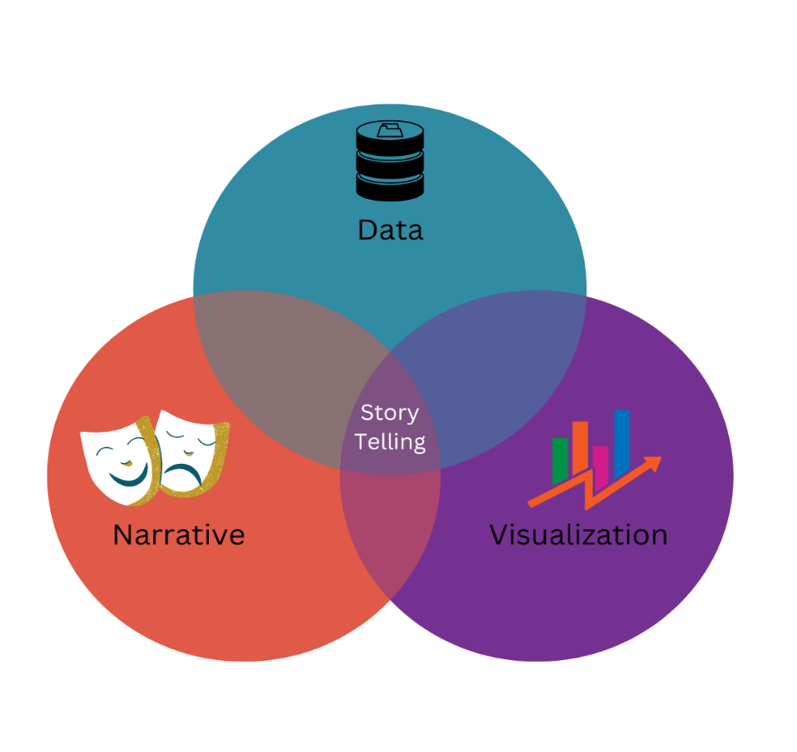
Data-driven storytelling is a powerful and effective way to communicate numerical data to an audience. Data storytelling is a structured approach to communicating insights about data, and it involves a combination of three key elements: data, visuals, and narrative. When visuals are applied to data, they can enlighten the audience with insights that they wouldn’t see without charts or graphs.
When these three key elements are successfully integrated, you have created a data story that can influence people and drive change.
1. Data: Analysis of accurate and complete data serves as the foundation of your data story. Analysing data using descriptive, diagnostic, predictive, and prescriptive analysis can enable you to understand its full picture.
2. Narrative: A verbal or written narrative, also called storylines, is used to convey insights gleaned from data, the context surrounding it, and actions you recommend and aim to inspire in your audience.
3. Visualizations: Visual representation of data and narratives helps tell stories clearly and memorably. This can be a chart, graph, chart, image, gif, or video.
Steps to tell a data story
Ø Define your problem
Ø Get data insights
Ø Know the audience
Ø Craft a data narrative
Ø Create effective visuals
To capture and engage your audience, your data story should focus on one concept and provide unique insights that are useful and valuable to your audience.
Benefits of Storytelling:
Ø Adding value to your data and insights.
Ø Interpreting complex information and highlighting essential key points for the audience.
Ø Providing a human touch to your data.
Ø Offering value to your audience and industry.
Ø Building credibility as an industry and topic thought leader.
Interactive and dynamic visualizations are helpful in storytelling. This is because they can be used to help guide the audience to the aspect of the data that are most pertinent to their needs or help them to reach the desired conclusion. Data Stories serve many purposes. They can be included in various internal and external communications like annual reports, brochures, websites, videos, and social media.
There are a few different ways to present your data story. A data dashboard presents all available data so you’re able to create your narrative.
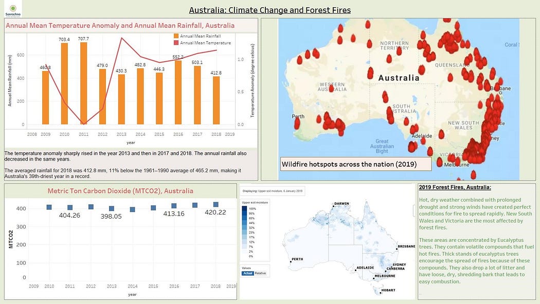
Example of storytelling using a dashboard in Tableau
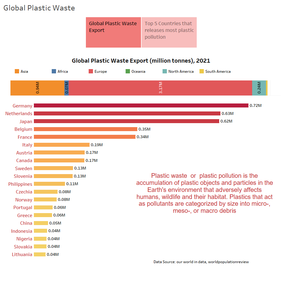
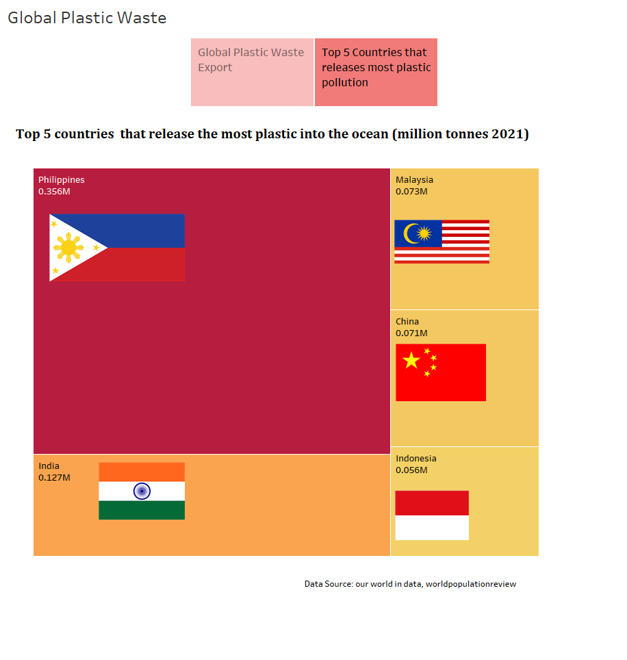
Example of storytelling using storyboard in Tableau: In a storyboard, we can have more dashboards that we can view by scrolling to know the story. Here we have used 2 dashboards showing a story on plastic waste.
Previously, dashboards and data visualization was used to understand advanced business data. Combining storytelling with business intelligence insights, storytelling with data can add context and guide organizations to decisions and outcomes. Different tools can be used for visual storytelling. Some of them are Tableau, Datawrapper, ArcGis Story Maps, Juicebox, Flourish etc. Creating a strong story is dependent on your being able to understand and translate that information from an unbiased point of view. Gartner claims that telling stories with data will be the most widespread means of consuming analytics by 2025.
Source: GWFM Research